LightDark

HomeForge

Product Lead / Senior UI–UX Designer
0-to-1 Construction Management SaaS
Quoting, project management, asset tracking, and client collaboration

Overview

HomeForge is a construction-focused SaaS platform designed to help builders and contractors manage the full lifecycle of a project, from lead intake and quoting to job execution, asset tracking, and client communication.

The product was built as a 0-to-1 platform, requiring foundational decisions around workflows, system architecture, and scalability from the outset.

The Problem

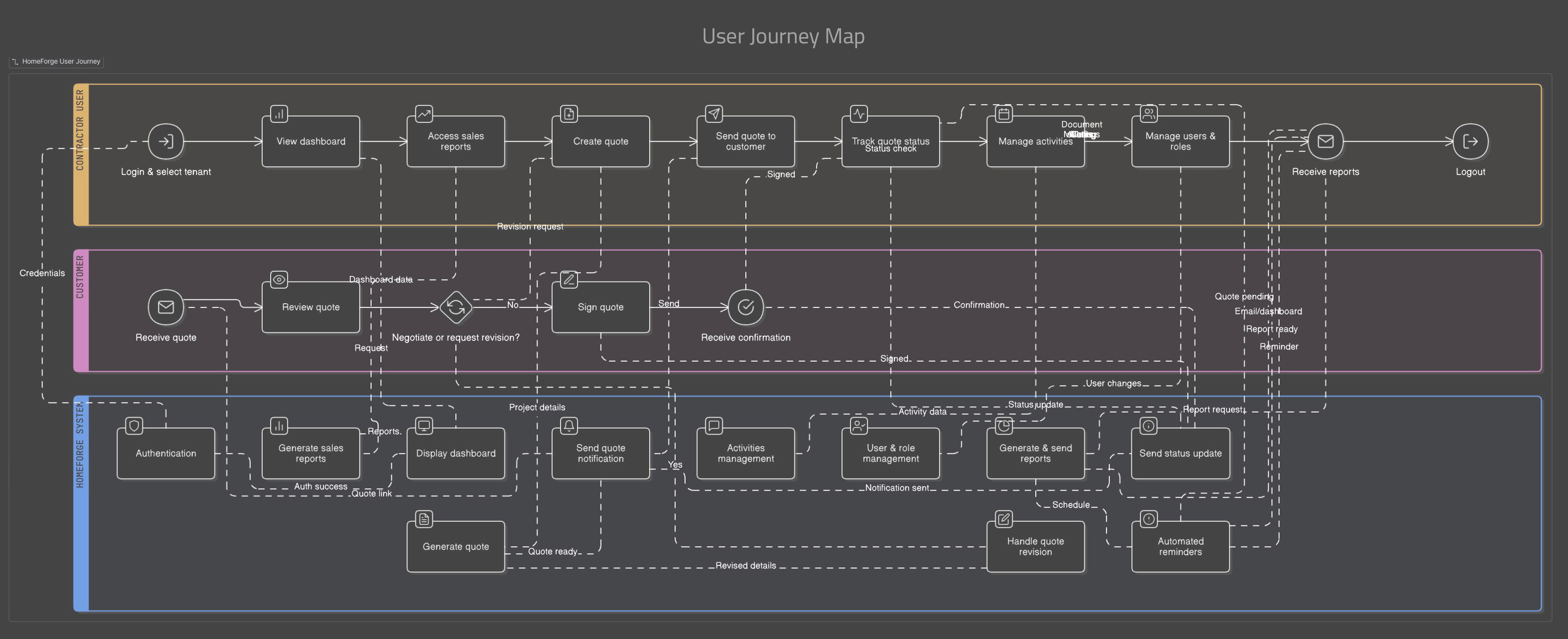
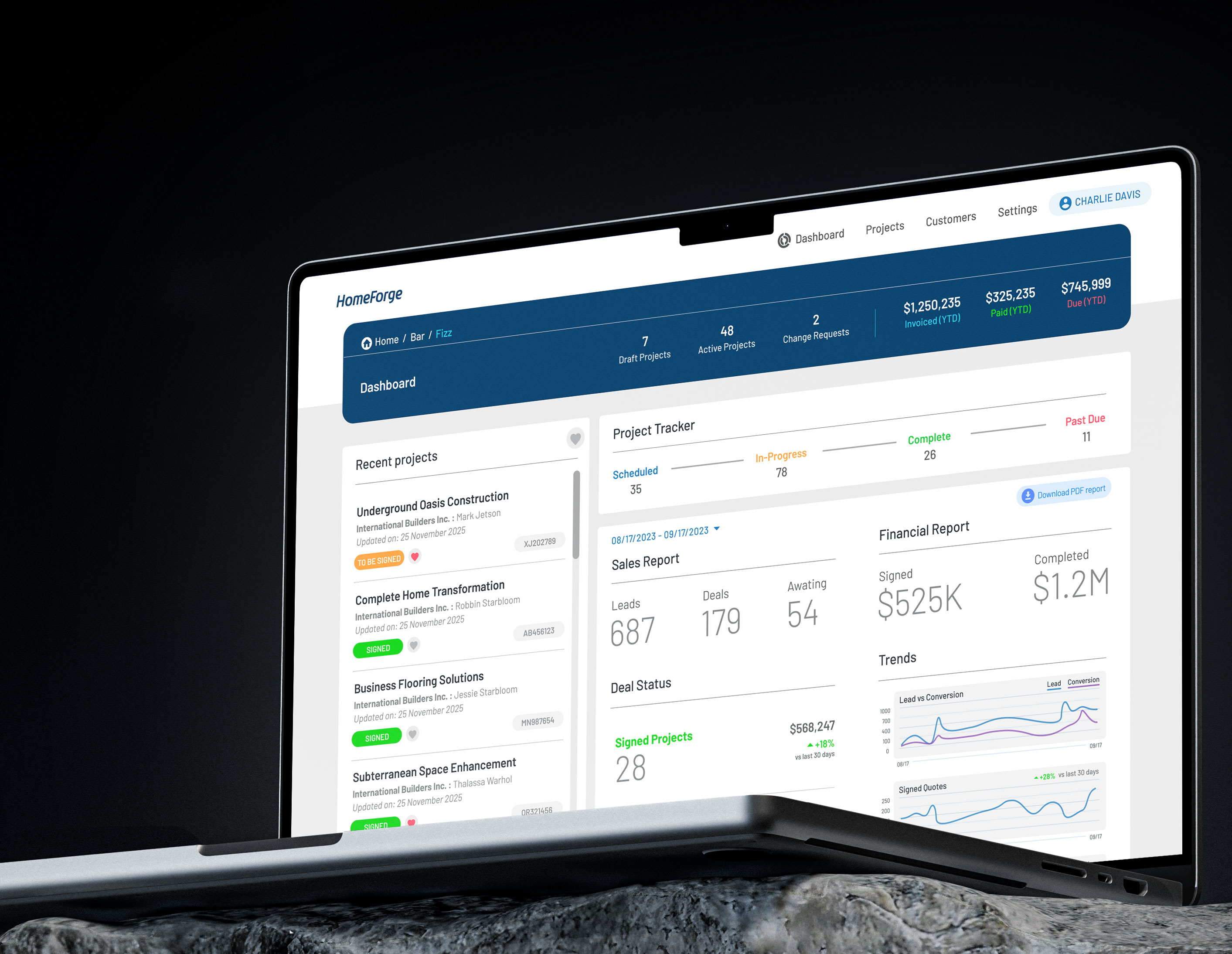
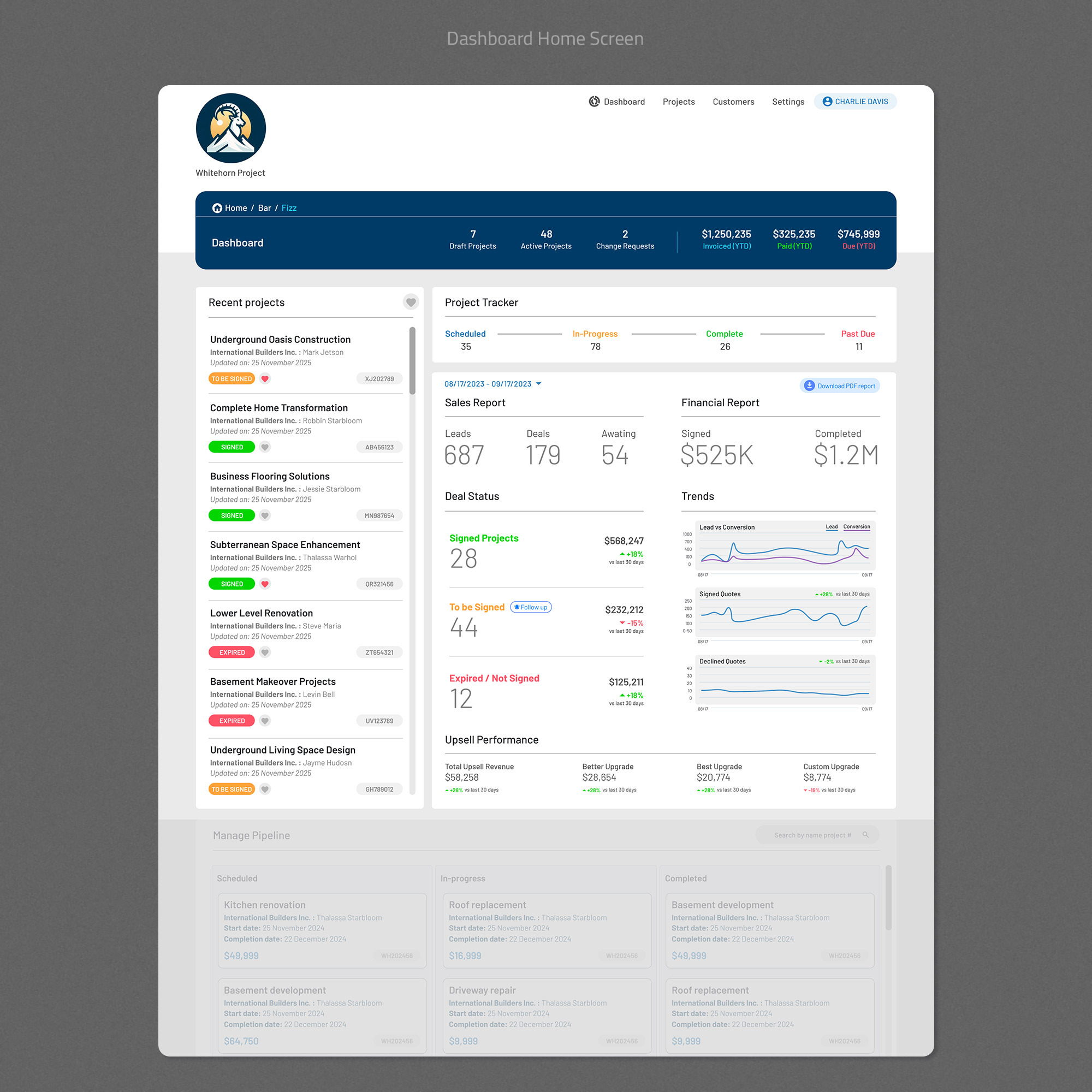
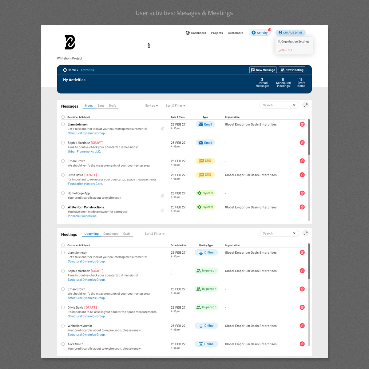
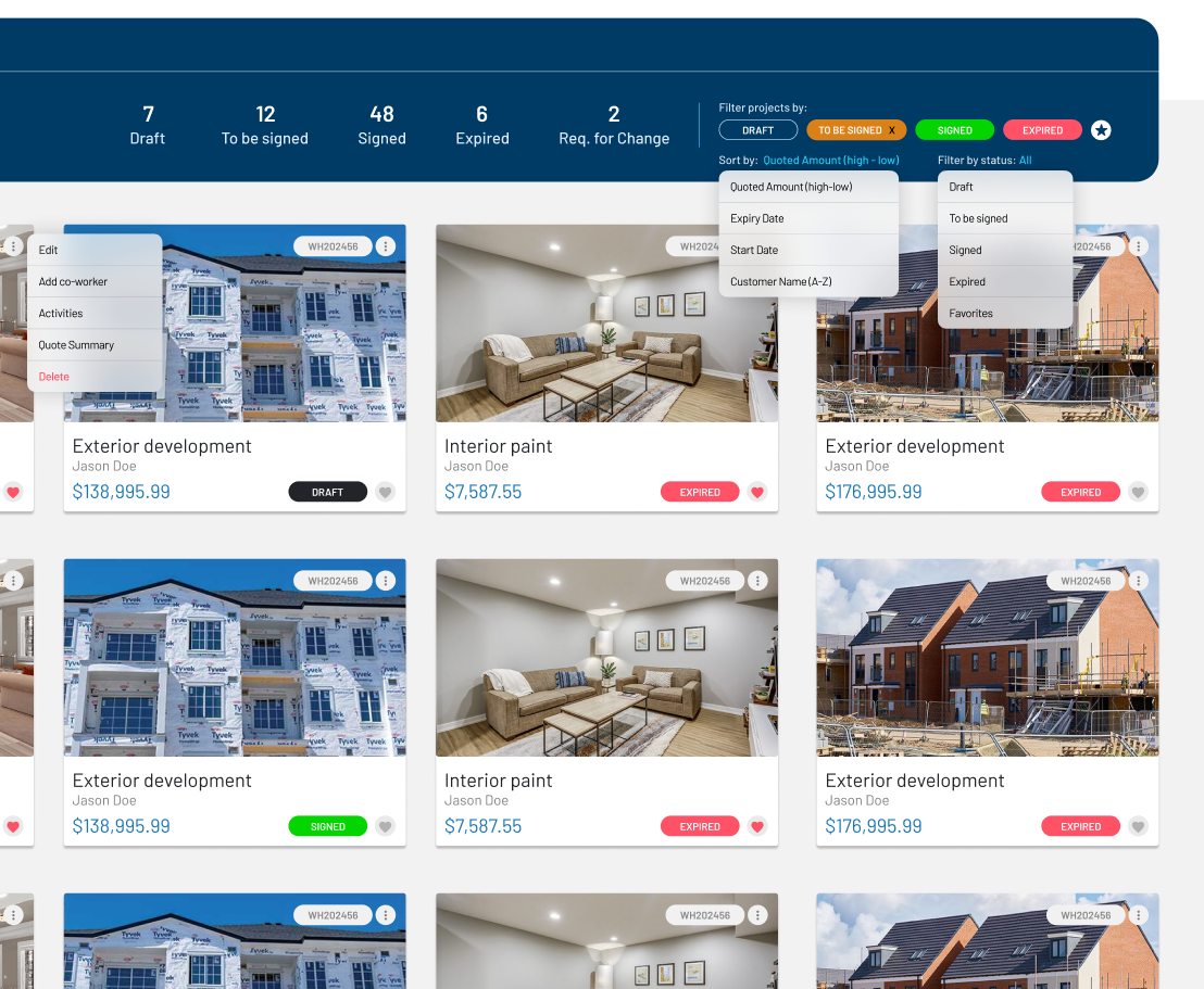
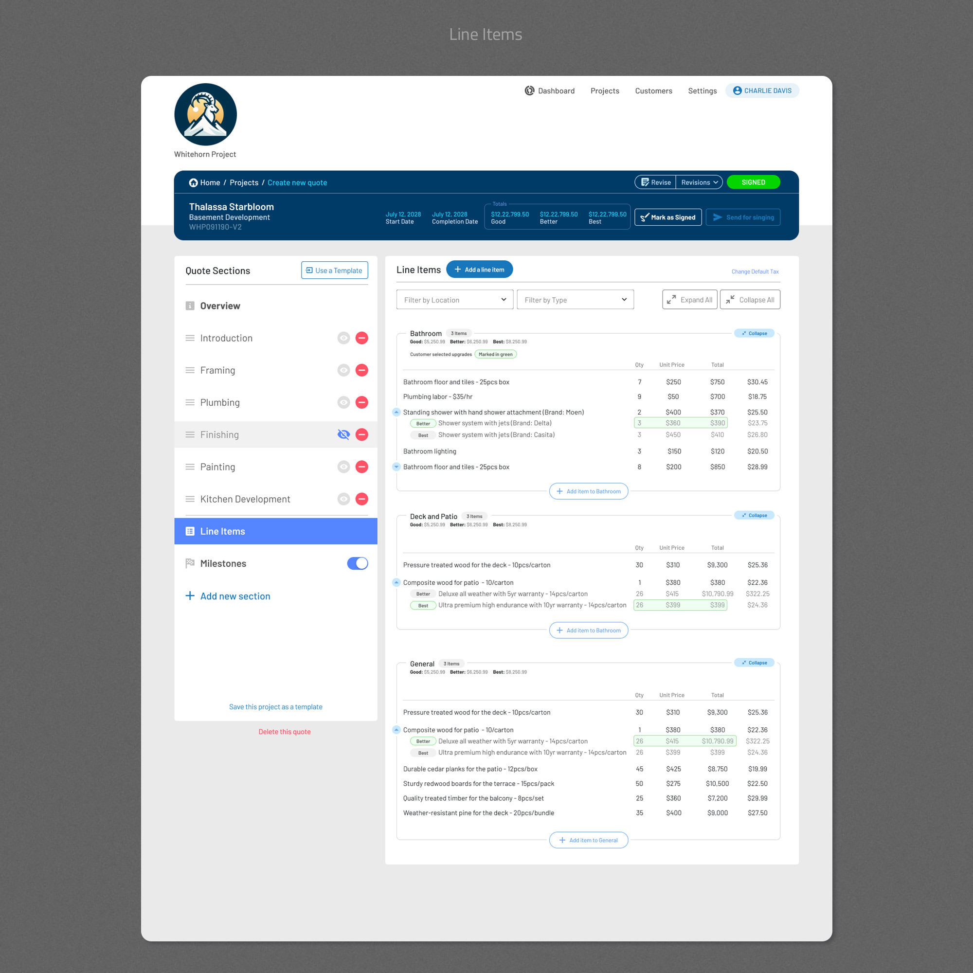
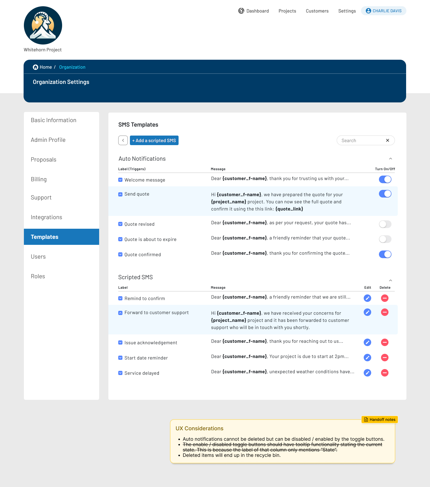
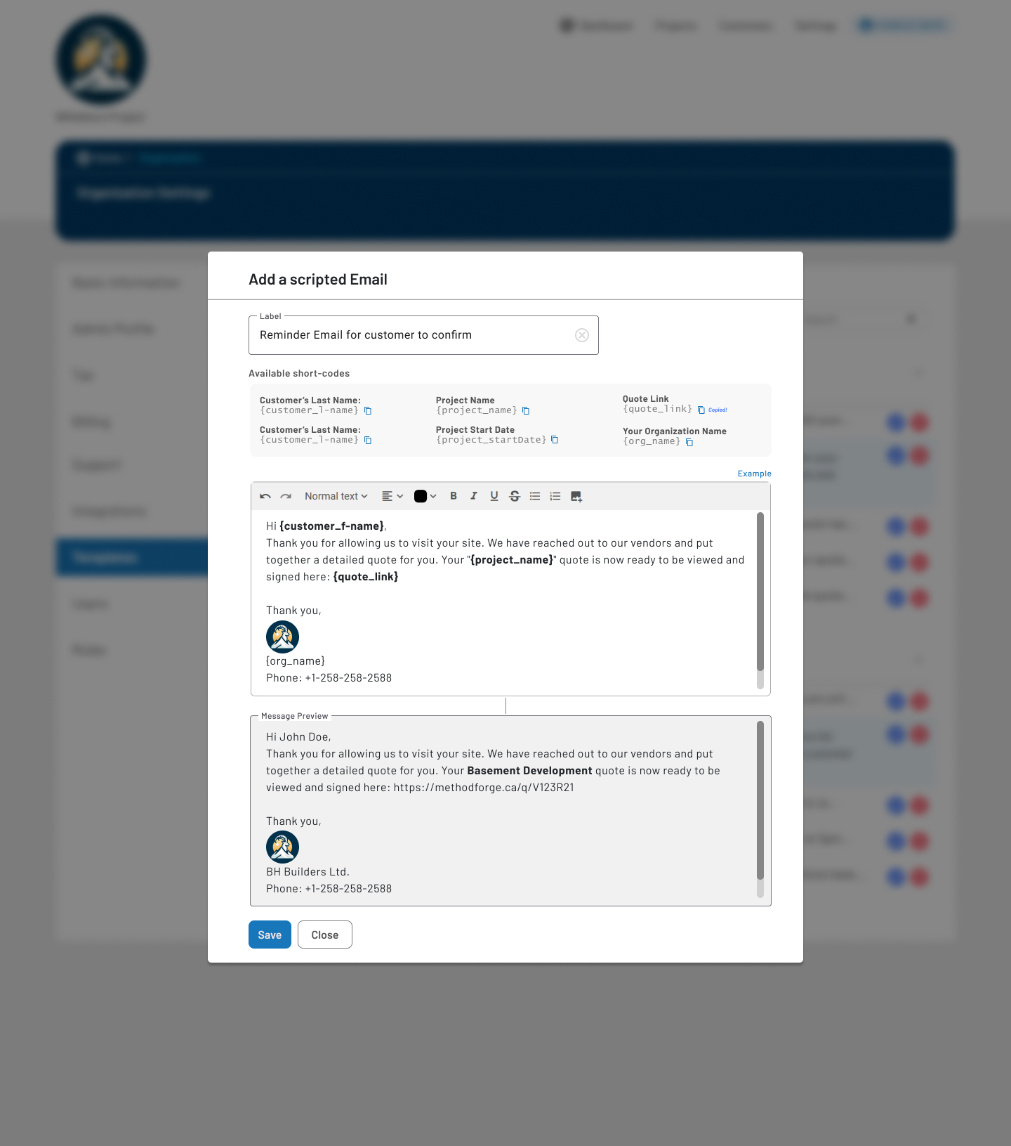
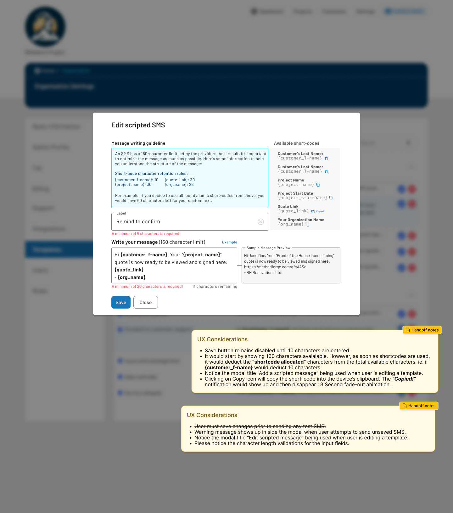
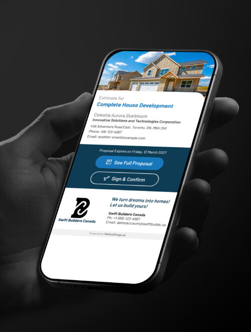
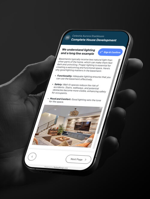
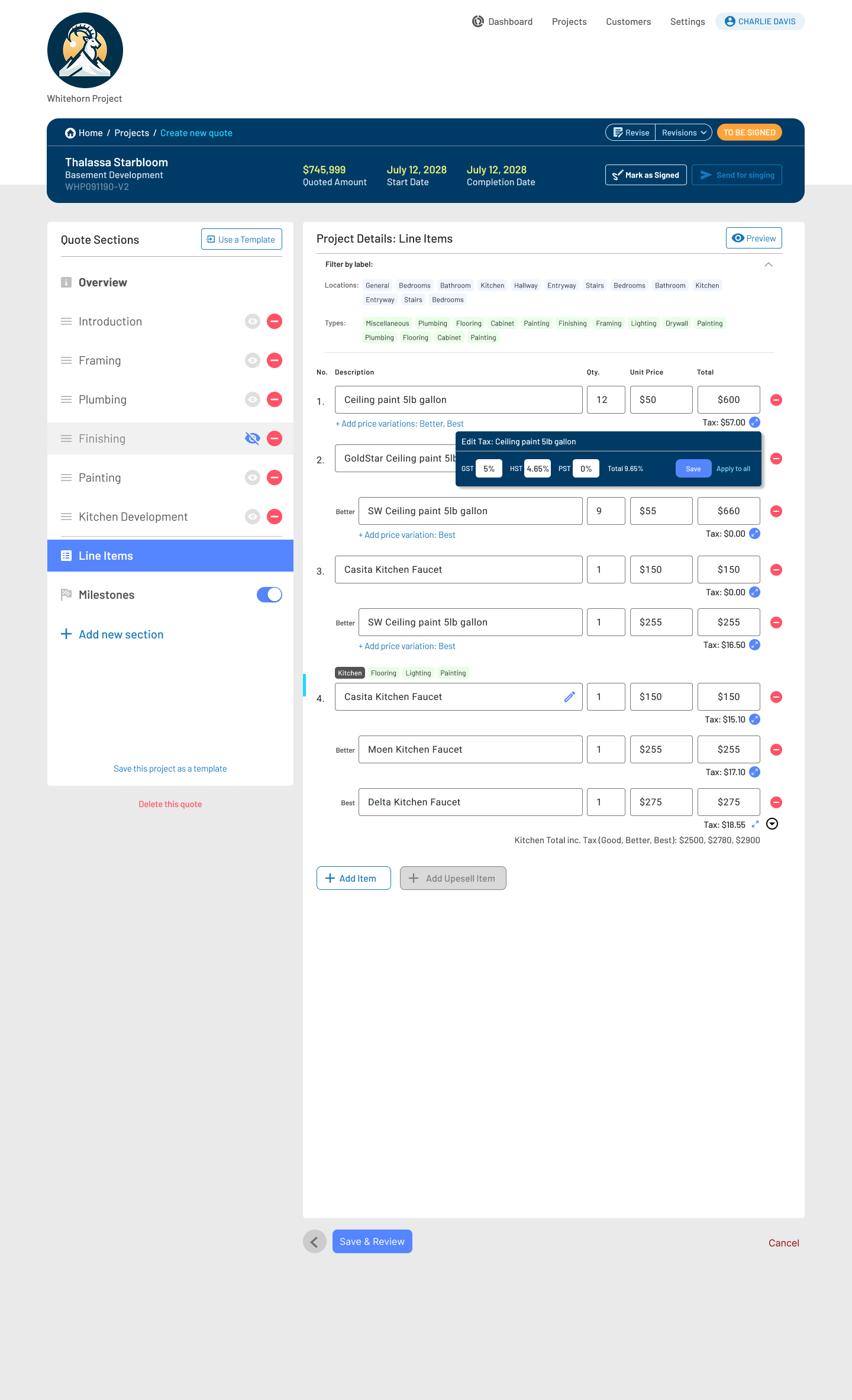
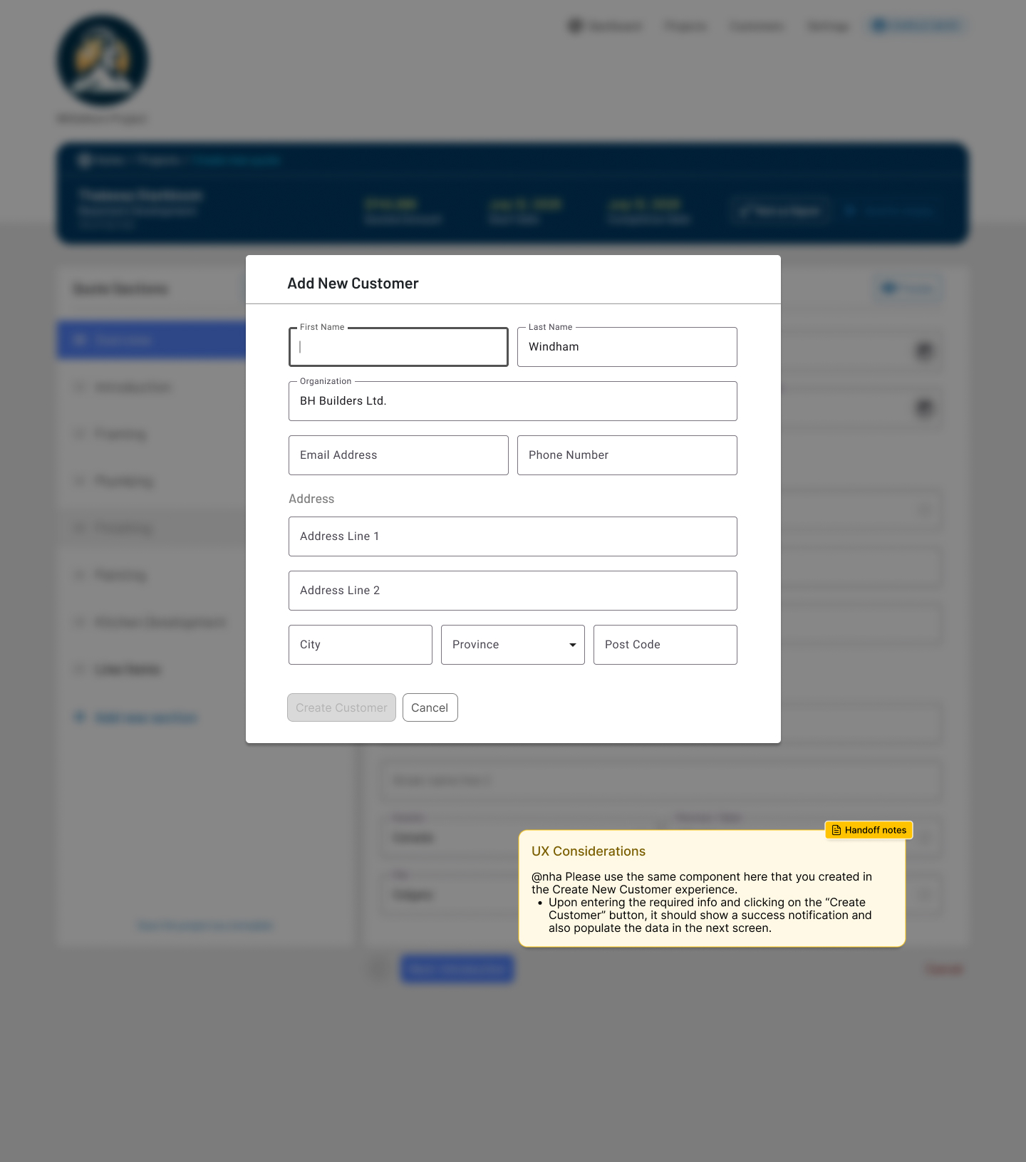
Construction teams rely on fragmented tools to manage quoting, projects, assets, and client communication. As a result:

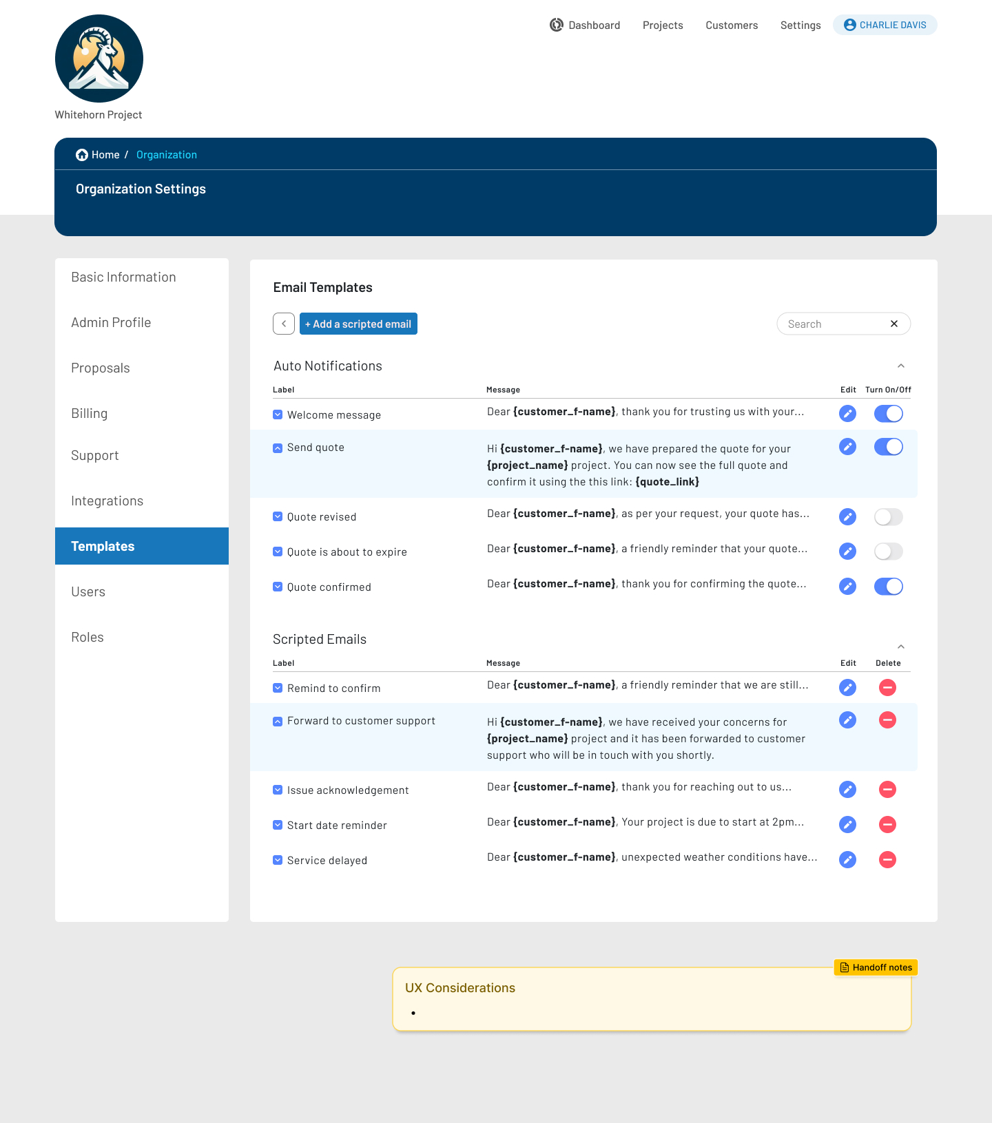
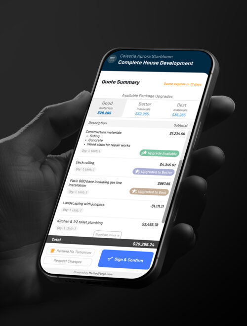
  • Quoting workflows were slow, difficult to manage
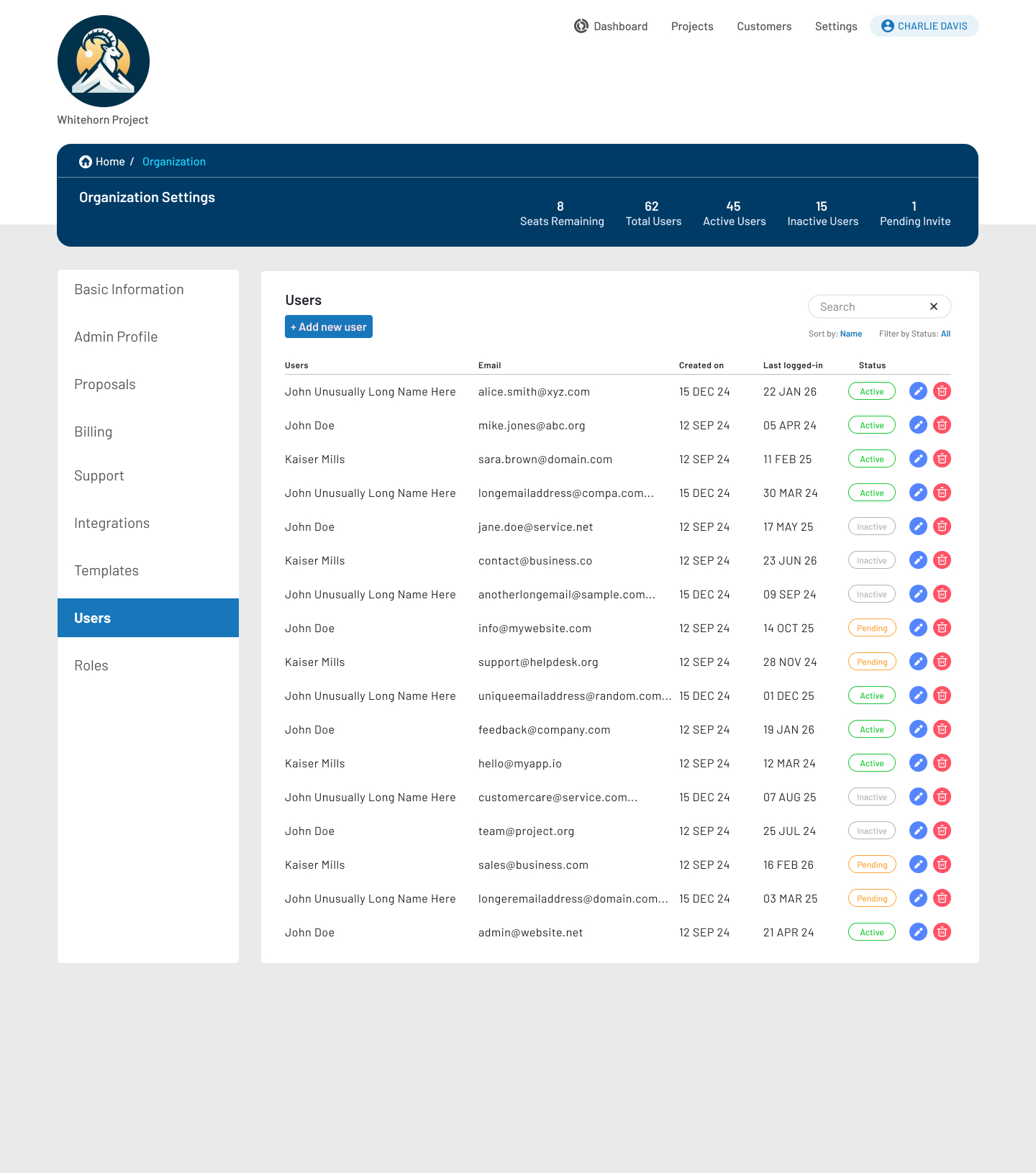
  • Users lacked real-time visibility into job status
  • Job data was spread across disconnected systems
  • Existing software solutions were either too generic or too rigid for real-world construction workflows
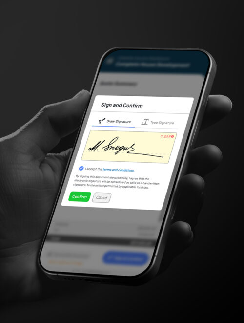
  • Admins waste a lot of time just handling contracts

The construction businesses needed a unified system that reflected how construction teams actually work, without adding operational overhead.

Company

Click-Harder

Product

HomeForge

Role

Sr. Product Designer /
Product Manager

Scope

Product strategy, UX architecture, workflows, design system, delivery

Platform

Web-based SaaS

Status

MVP to scalable foundation

Constraints & Real-World Complexity

This was not a greenfield design exercise.
Key constraints included:

  • Multi-role supporting: admins, estimators, project managers, and clients
  • High data density across daily operational screens
  • Construction workflows that vary by company, project type, and region
  • Need to ship a usable MVP while avoiding long-term UX debt
  • Balancing flexibility with consistency across the platform

Every design decision needed to scale beyond the MVP.

My Role & Ownership

I owned the end-to-end product UX from concept through execution.
Responsibilities included:

  • Defining product UX strategy and MVP scope
  • Mapping end-to-end workflows across the construction lifecycle
  • Designing core operational experiences (quoting, jobs, assets, admin)
  • Creating a scalable UI and interaction system for data-heavy screens
  • Partnering closely with engineering to ensure delivery and speed

This role combined product thinking, UX leadership and design execution.

MVP Process & Decision Making

End-to-End Journey Mapping

I began by mapping the full operational lifecycle of a construction project:

  • User Onboarding
  • Lead intake
  • Estimation and quoting
  • Project setup and execution
  • Job completion and status management

This journey mapping work aligned stakeholders on scope, surfaced operational bottlenecks, and helped define what truly belonged in the MVP.

A bird’s eye view of the 3-tier UX research covering decision logic, interaction scopes, data points, and how backend and front-end requirements are paired together and factored into UX consideration and later transitioning to UI designs. Click on the image to enlarge.

"MVP" Designing for Operational Reality

Rather than oversimplifying the UI, I focused on:

  • Clear visual hierarchy for dense admin screens
  • Status-driven design to surface what needs attention
  • Consistent patterns across tables, forms, and workflows
  • Reducing cognitive load without hiding critical information

The goal was speed, clarity, and confidence for daily users.

Core Admin & Operations Dashboard

  • Centralized visibility into jobs, statuses, and actions
  • Status indicators designed for quick scanning
  • Structured layouts to handle high data volume

This dashboard became the operational backbone.

Quoting & Job Management

  • Streamlined quote creation and editing
  • Separation between draft, active, and completed states
  • Reduced friction in transitioning quotes into active jobs

Design decisions prioritized accuracy and efficiency over visual flair.

Design System & Scalability

To support long-term growth:

  • Established reusable UI components and patterns
  • Defined status colors, actions, and feedback states
  • Designed advanced reusuable component states
  • Ensured design decisions aligned with engineering constraints

This reduced friction between design and development and laid a strong foundation for future iterations.

Asset & Workflow Management

  • Structured lists and tables for managing assets and tasks
  • Consistent interaction patterns across different data types
  • Scalable UI patterns that could support future features

This ensured the platform could grow without rework.

Email & SMS Templates

Designed a flexible messaging system that allows users to initiate and continue automated and scripted communications with their customers.

Email Templates

  • Enabled dynamic personalization using short-codes (customer name, project, links)
  • Added real-time message previews to show resolved variables
  • Clearly separated system-triggered notifications from custom scripted emails
  • Maintained brand consistency while allowing customization at scale


SMS Templates

  • Designed with carrier character limits in mind
  • Introduced character deduction logic for dynamic short-codes
  • Provided inline validation and remaining character feedback
  • Prevented send errors through clear constraints and previews

This template approach empowered teams to confidently manage customer communication while avoiding costly mistakes and support overhead.

Multi-Tenancy & User Management

Designed a scalable multi-tenant SaaS architecture that supports multiple organizations operating independently within a single platform.

  • Defined a clear organization → projects → users hierarchy to prevent data crossover
  • Scoped navigation, settings, and permissions contextually to the active organization
  • Designed reusable admin patterns that adapt across tenants without fragmenting UX
  • Supported future growth for billing tiers, seat limits, and feature gating

Enabled enterprise-level flexibility while keeping the experience approachable for smaller teams.

Mobile First End-Customer Experience

Sticky Header & Footer, Progressive Disclosure

  • Sticky header keeps project context visible at all times
  • Sticky footer anchors primary CTAs (Sign & Confirm, Request Changes)
  • Prevents users from “losing” actions in long quote breakdowns
  • Detailed line items are scrollable while totals and actions stay fixed
  • Optional upgrades (Good / Better / Best) are visually grouped and easy to compare
  • Reduces overwhelm while preserving transparency


Touch-Optimized Interactions

  • Large tap targets for buttons and toggles
  • Clear visual states for upgrades, reminders, and confirmations
  • Inline feedback to confirm actions instantly


UX Strategy & Principles

  • Ensured UX usability for critical actions
  • Reduced cognitive load by breaking down complex information
  • Ensured all high-intent actions remain accessible
  • Ensured practical breakpoints for various screen sizes