Care1
Principal UI–UX Designer (with Product Lead responsibilities)
Healthcare SaaS for Vision Treatment: Led UX strategy, core clinical workflows, worked with engineering, compliance, and data teams to ensure the platform scaled responsibly in a regulated healthcare environment.
Overview
Care1 was built for clinicians operating under time pressure, high cognitive load, and strict regulatory requirements. The product needed to support fast, confident decision-making while preserving clinical accuracy, traceability, and trust.
This was not a consumer-style UX problem. The challenge was designing a dense, professional-grade clinical system where clarity, hierarchy, and workflow alignment directly impact patient outcomes.
The Problem
Eye care clinicians were forced to piece together patient context across disconnected systems, lengthy wait times and delayed diagnosis. Key challenges:
- Slow, multi-step review during patient encounters
- Diagnosis fragmented across reports, history etc.
- Inconsistent documentation and decision tracking
- Limited longitudinal insight and follow-up planning
- Unclear patient status across clinics
- Weak collaboration support within clinic workflows
The platform needed to reduce time-to-decision while maintaining clinical rigor, compliance, and confidence.
Company
Care1
Product
Care1 AI Eyecare
Role
Principal UI–UX Designer
Product Lead responsibilities
Scope
UI Unification, product strategy, design System, UX architecture, workflows, UX/QA
Platform
Web-based SaaS
Status
Net positive product & scaling
Constraints & Real-World Complexity
Care1 operated in a highly constrained environment:
- Regulated healthcare data with strict privacy and compliance requirements
- Dense, multi-panel clinical screens where information hierarchy is critical
- Multi-role access patterns across optometrists, specialists, and clinic staff
- AI features that required careful UX framing to avoid over-reliance
- Continuous delivery cadence with frequent feature rollouts
Design decisions had to balance speed, safety, and long-term scalability. Team needed a collaborative framework which can reduce friction and ensure the daily CI/CD pipeline velocity.
My Role & Ownership
I owned the end-to-end UX for Care1’s core product. Responsibilities included:
- Defining UX strategy aligned to product and compliance goals
- Designing core diagnostic, review, and documentation workflows
- Leading discovery and continuous clinician research
- Designing AI-assisted diagnostic experiences and trust mechanisms
- Maintaining and evolving a scalable design system
- Partnering closely with engineering on feasibility, sequencing, and delivery
- Improving design-to-development efficiency through better handoff and systemization
Process and Decision-Making
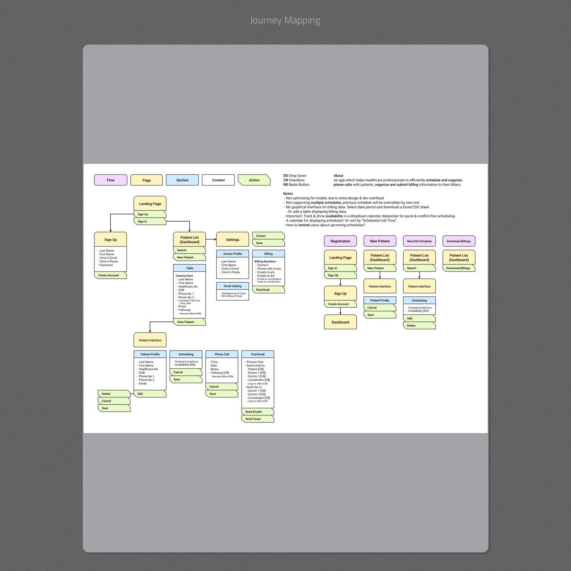
1. Workflow Mapping Before Interface Design
I began by mapping the full clinical journey from patient list to encounter review, diagnosis, and follow-up. This clarified where decisions were made, what evidence was needed at each step, and where breakdowns occurred.
- Align stakeholders on scope and priorities
- Identify critical decision points
- Prevent feature creep during MVP delivery
- Ensure the interface mirrored real clinical flow
2. Solving Layout and Information Hierarchy Early
In clinical software, layout is functionality. Before visual polish, I focused on wireframes that solved:
- Evidence placement and comparison
- Progressive disclosure of detail
- Minimizing unnecessary scrolling and navigation
- Clear separation between evidence and plan
This reduced rework later and ensured usability under pressure.
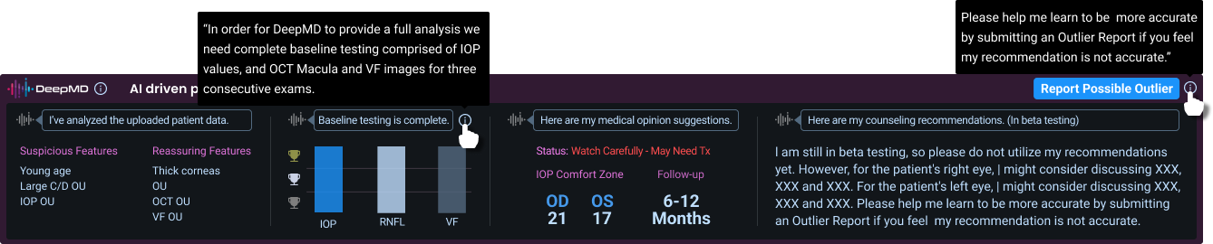
3. Designing AI as an Assistive Layer
AI features were intentionally framed as support, not authority. Design decisions included:
- Separating suspicious and reassuring indicators
- Showing testing completeness and confidence signals
- Providing suggested follow-up windows instead of directives
- Including feedback feeder to improve model accuracy
This approach increased clinician trust and adoption without introducing clinical risk.
4. Systemizing the UI for Scale and Delivery
To support long-term growth and frequent releases, I focused heavily on systemization:
- Reusable UI patterns for dense data tables and panels
- Consistent status indicators and alerts
- A coded design system reducing implementation friction
This significantly improved design-to-development efficiency and reduced UI drift over time.
Key UX Considerations
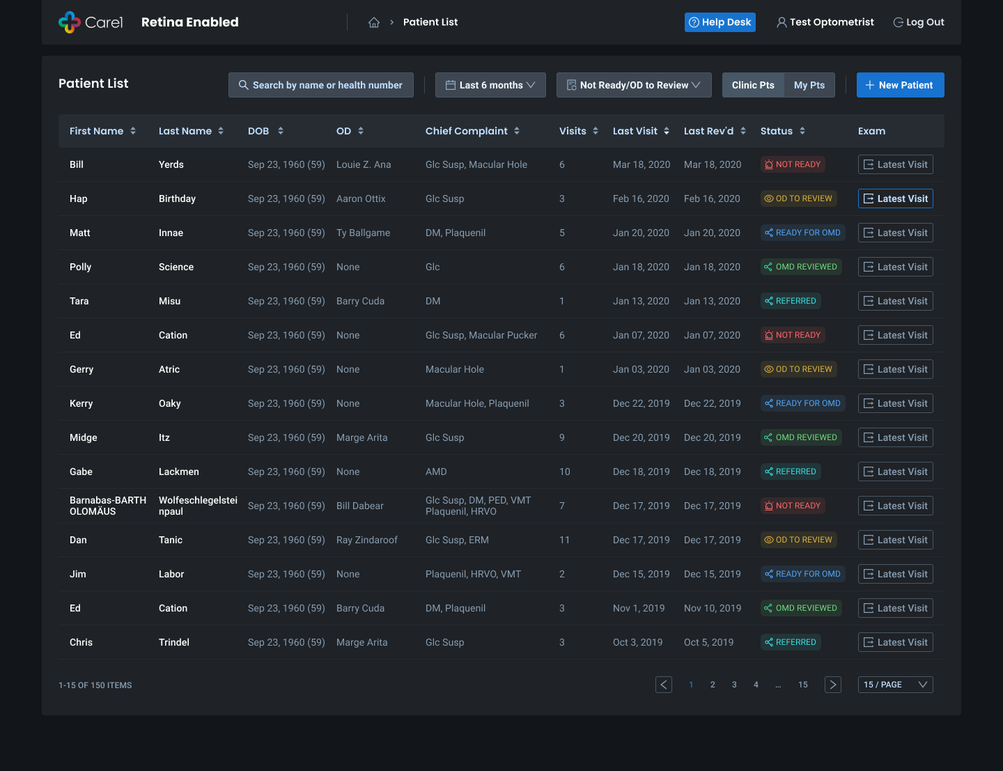
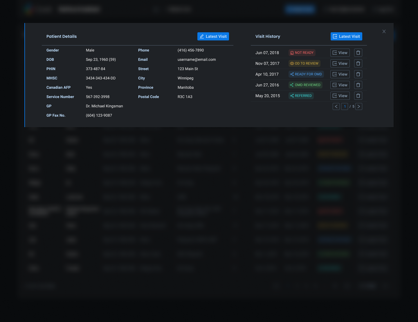
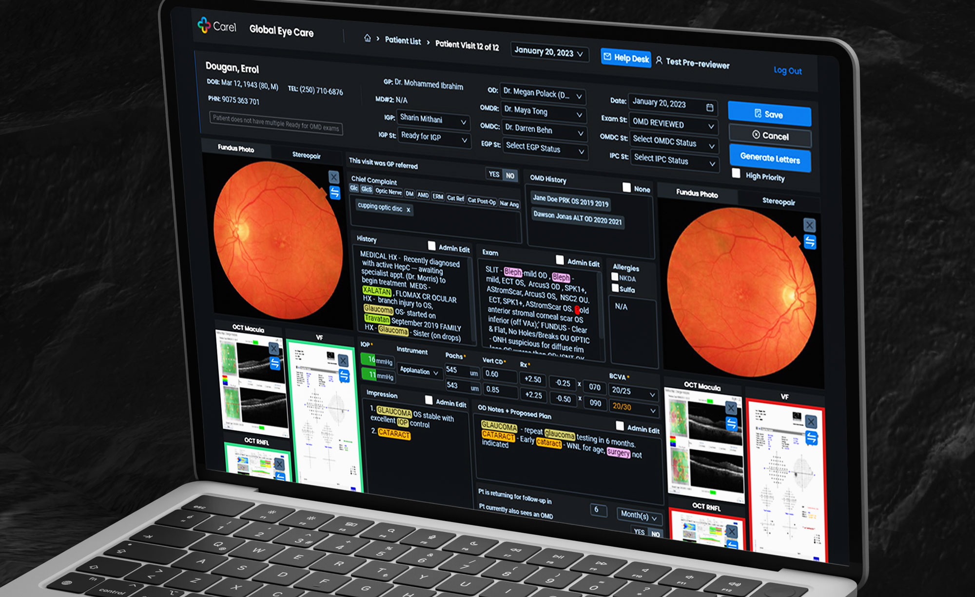
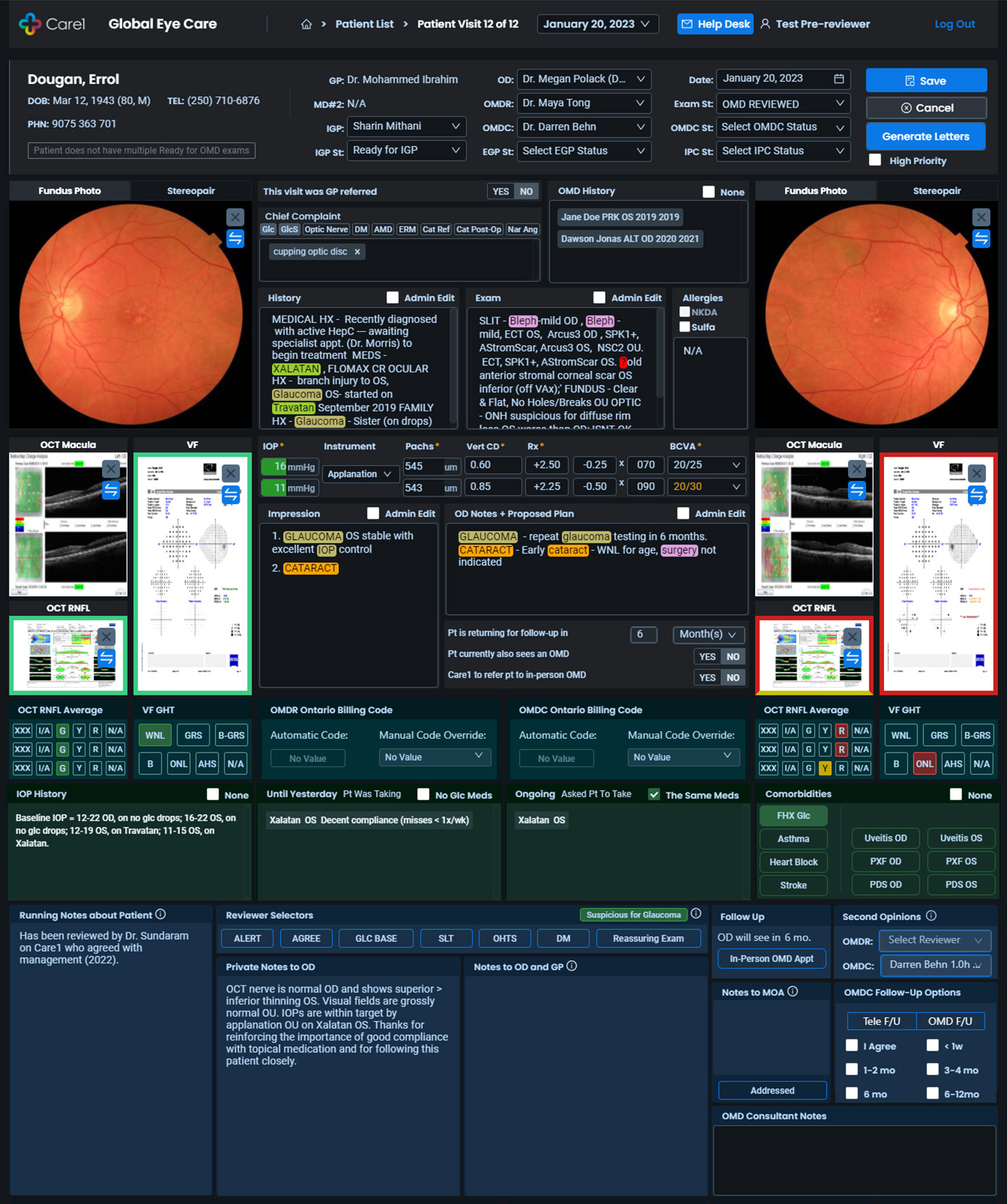
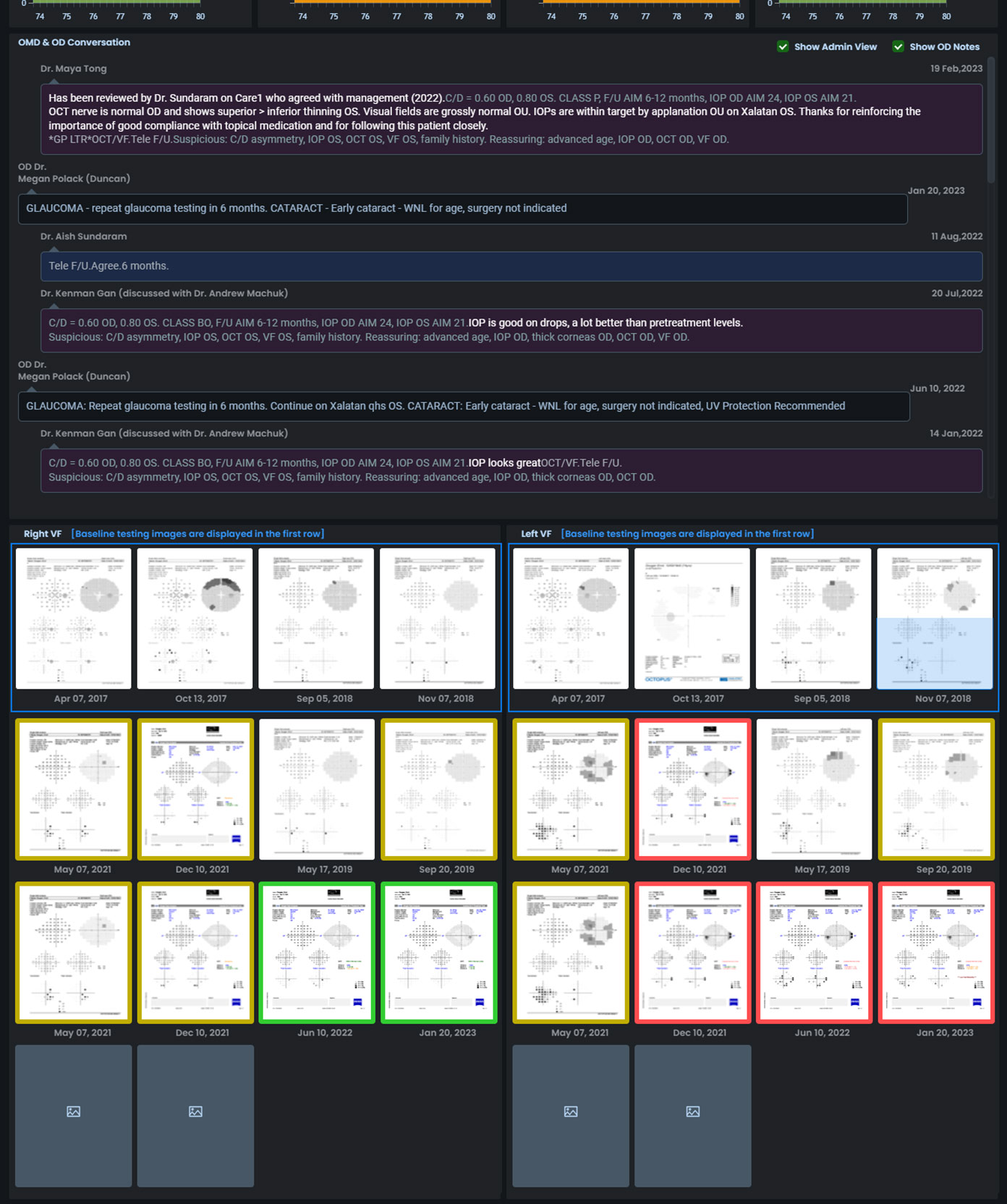
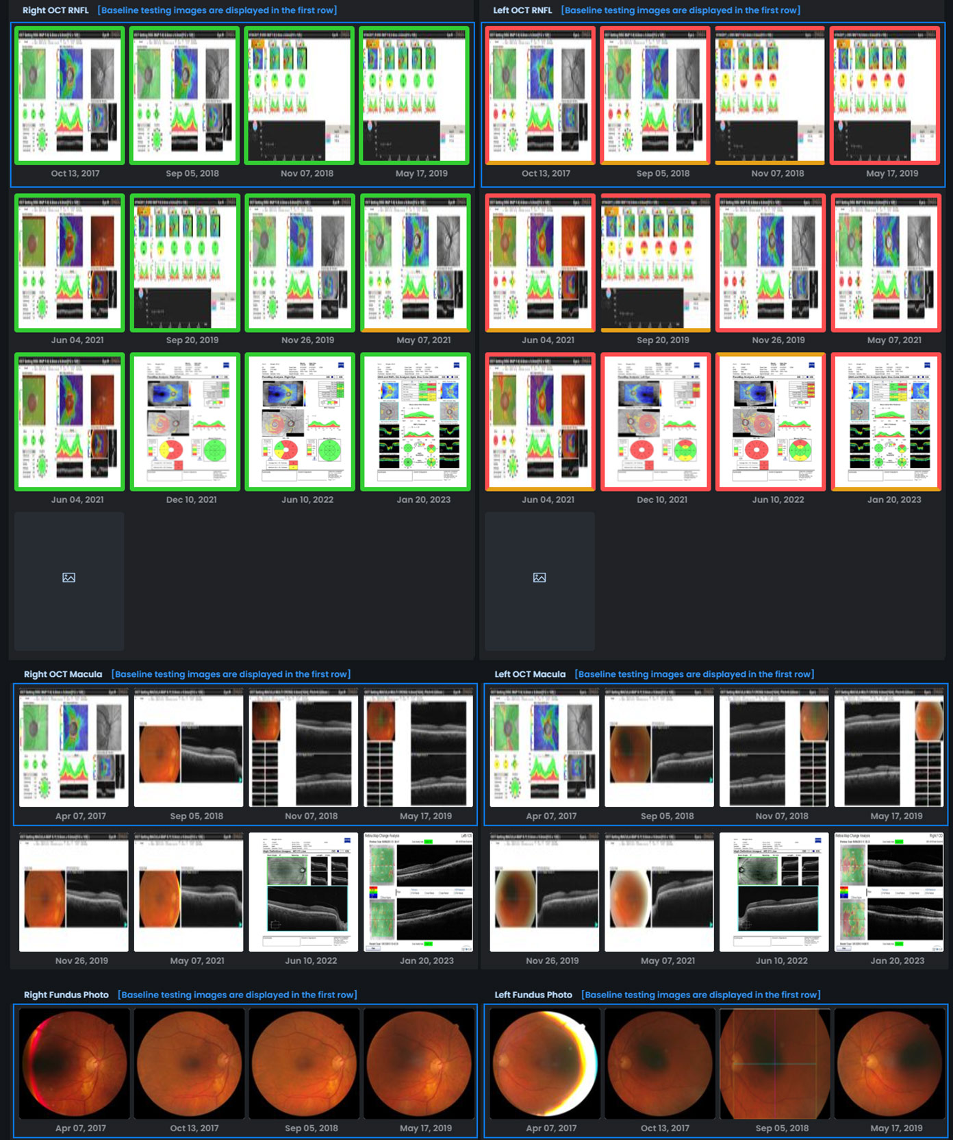
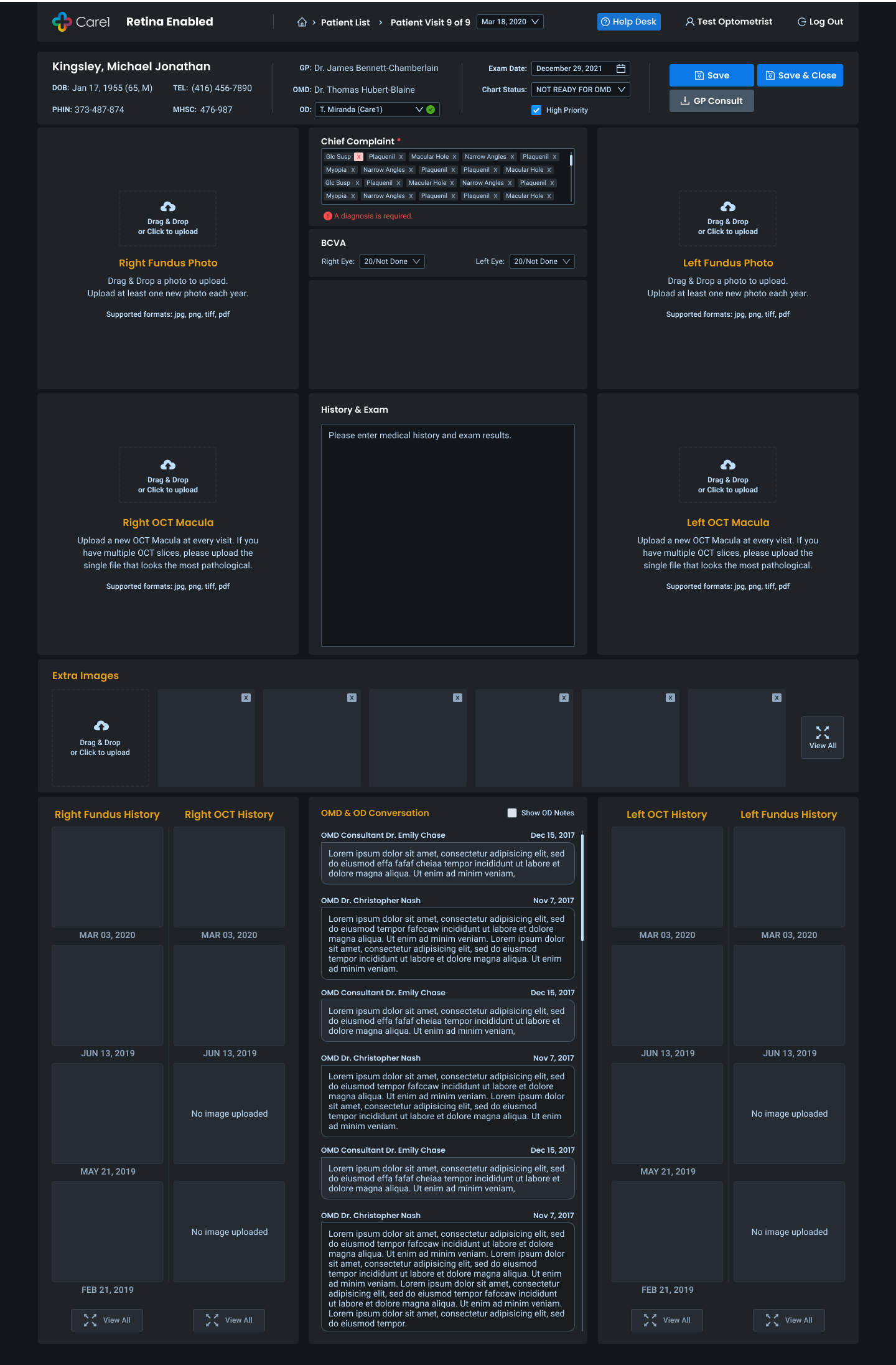
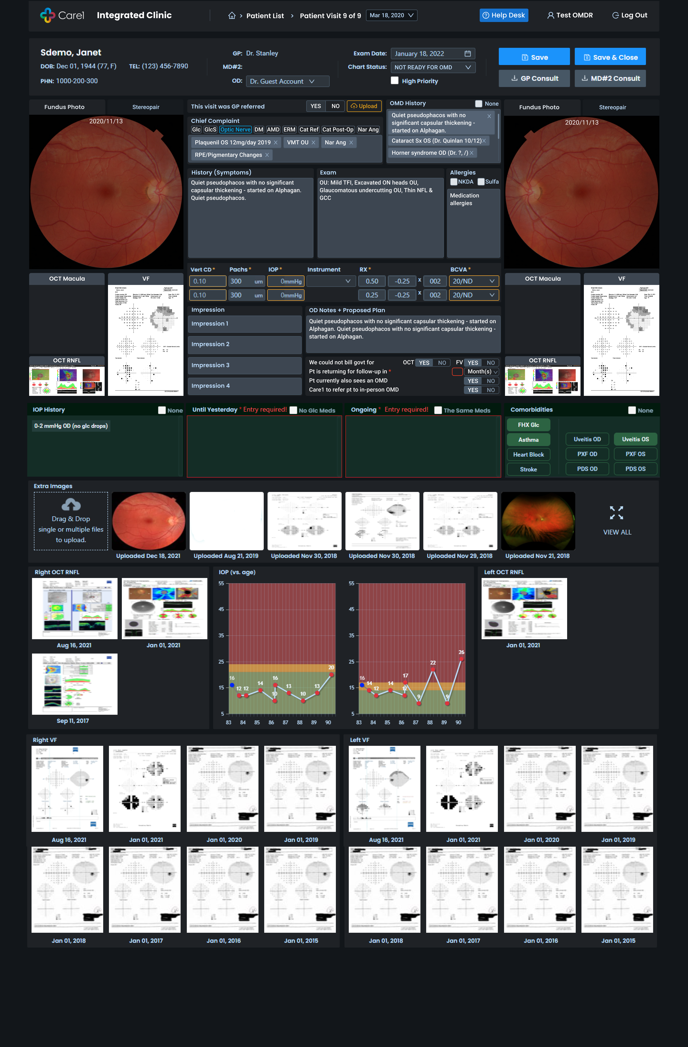
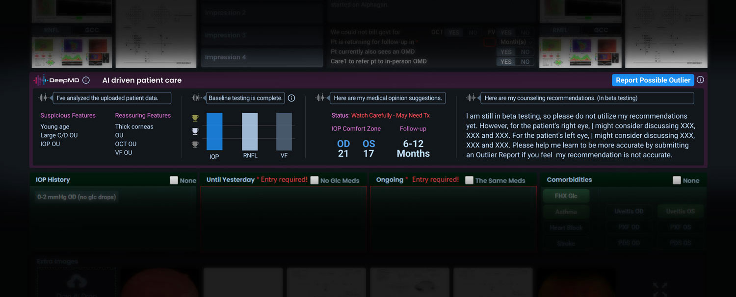
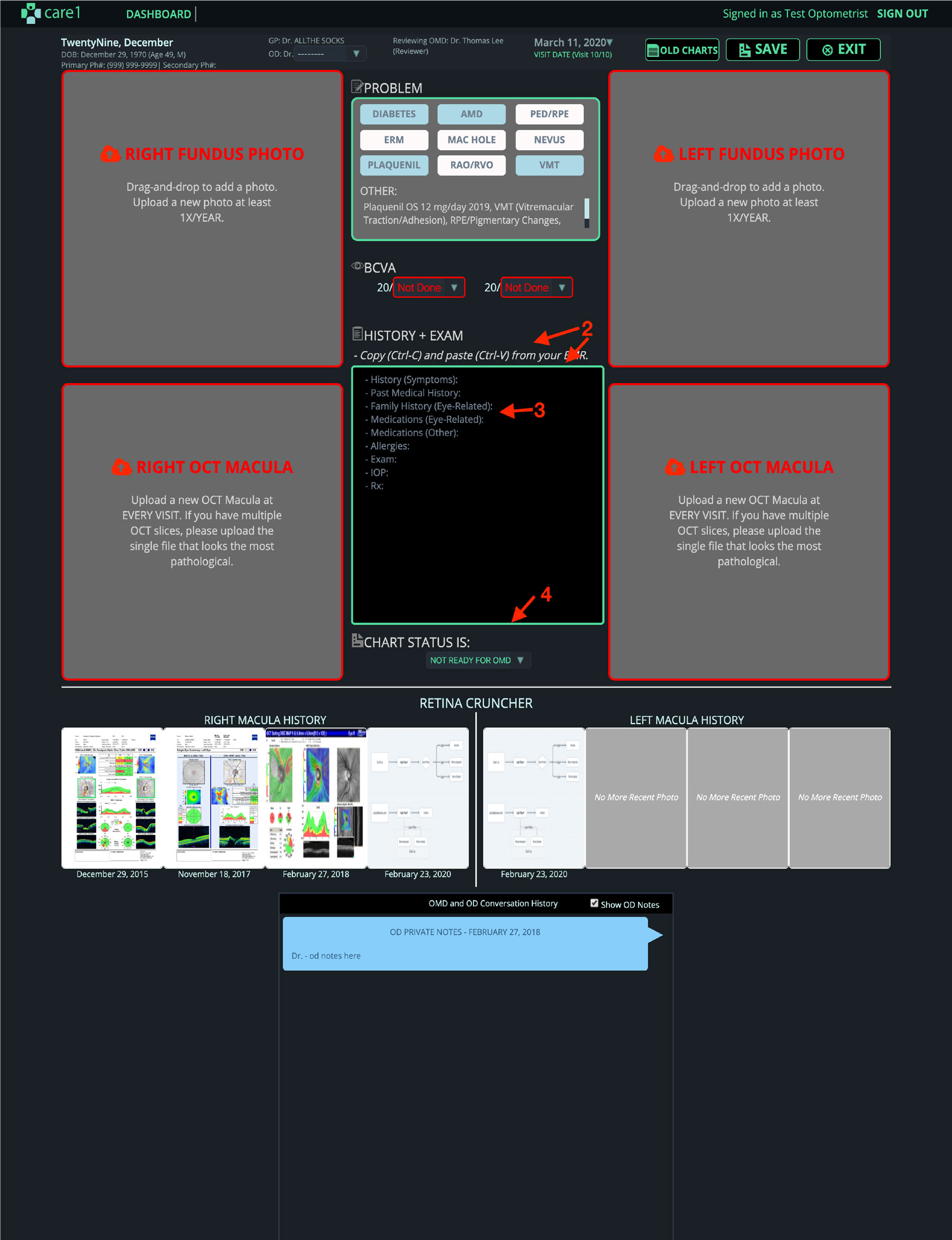
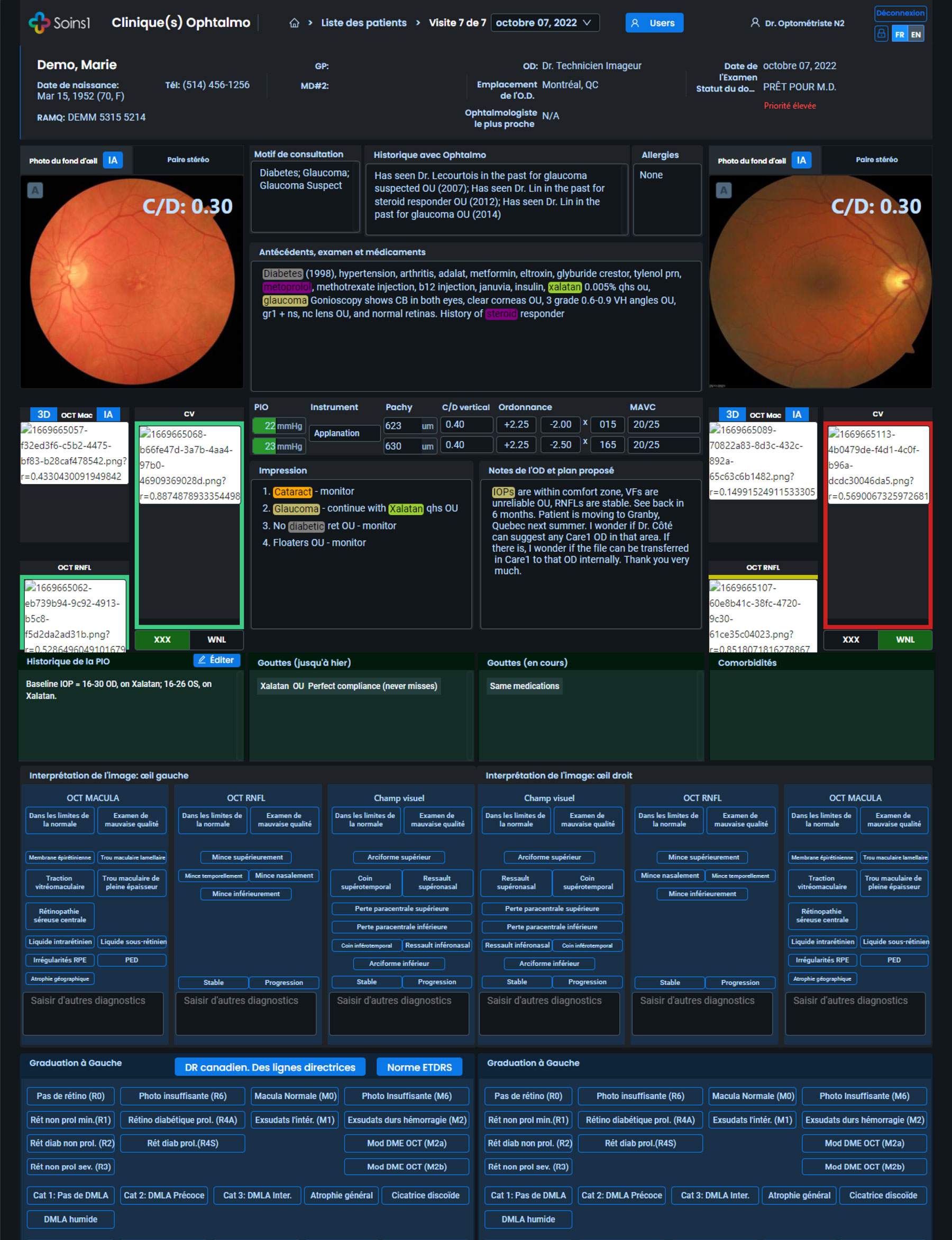
Patient Encounter and Diagnosis Workspace
The core clinical cockpit where decisions are made.
Design priorities:
- Side-by-side diagnostic evidence and history
- Fast scanning with strong visual hierarchy
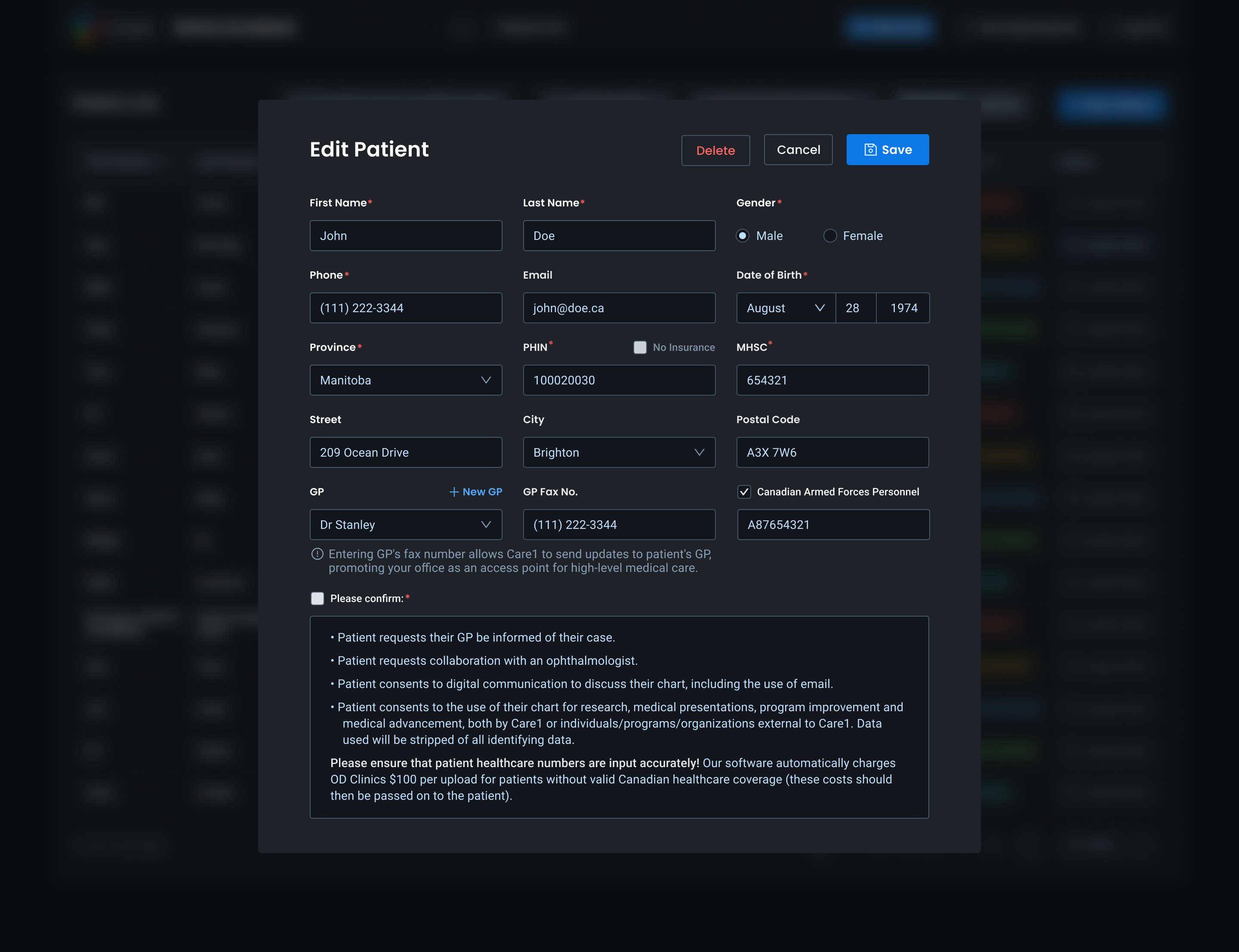
- Minimal friction for documentation and impressions
- Longitudinal visibility across visits
- Clear status visibility across patient lists
- Consistent indicators for readiness and review state
- Reduced ambiguity during handoffs: technician > doctor
- Faster identification of next actions
This reduced operational friction and improved care continuity. The result was a workspace optimized for speed, clarity, and confidence.
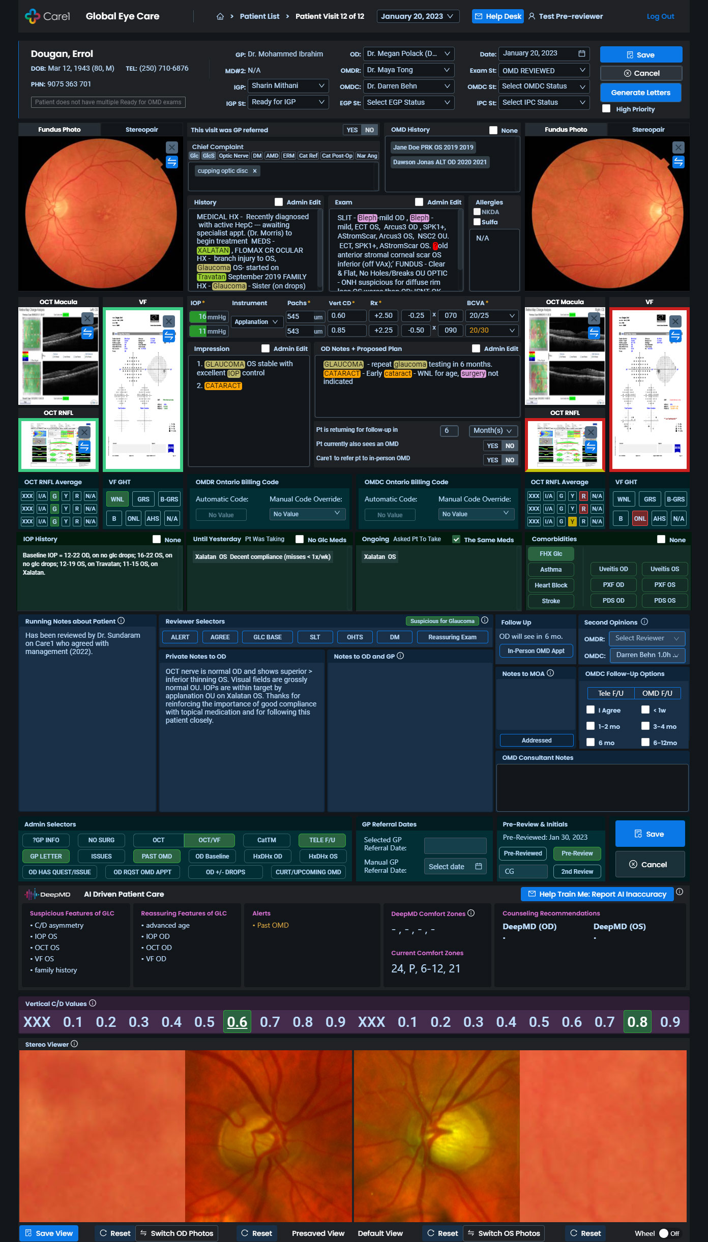
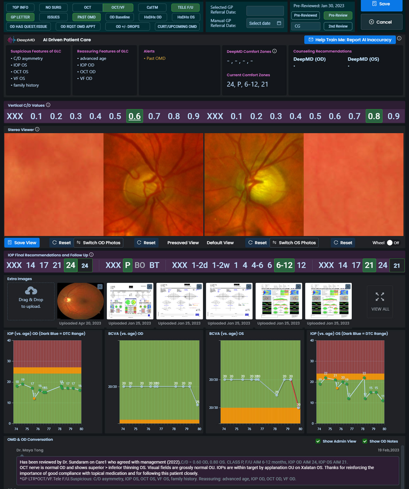
AI Assisted Diagnosis
An assistive panel designed to enhance clinical judgment.
Key UX elements:
- Clear distinction between risk signals and reassurance
- Transparent status indicators and testing completeness
- Follow-up guidance framed as suggestions
- Explicit disclaimers and feedback loops
This supported better decisions while maintaining clinician autonomy.
Patient Status and Clinic Operations
Operational clarity was critical for clinics managing many patients. UX improvements included:
- Clear status visibility across patient lists
- Consistent indicators for readiness and review state
- Reduced ambiguity during handoffs
- Faster identification of next actions
This reduced operational friction and improved care continuity.
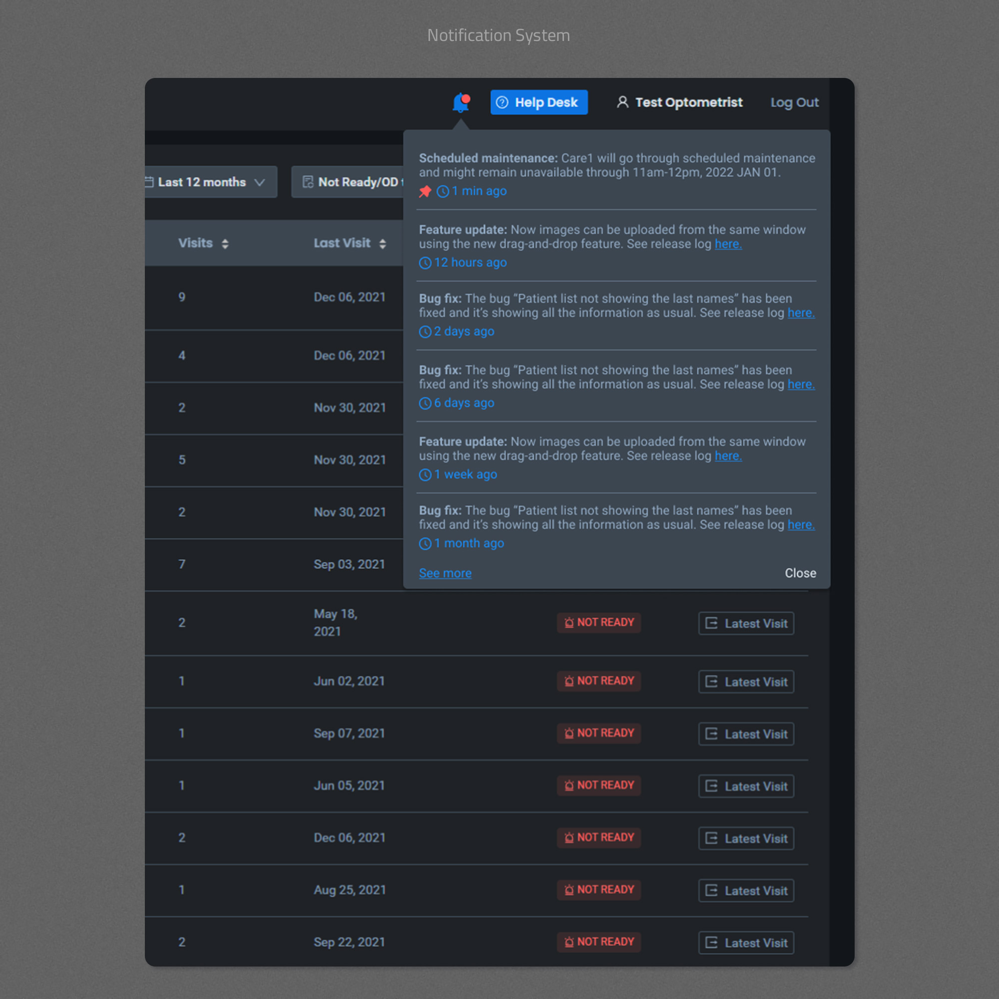
Notifications and System Trust
I designed in-product notifications to communicate:
- Scheduled maintenance
- Feature updates
- Bug fixes and system changes
This increased transparency, reduced support burden, and reinforced trust in the platform.
Design System and Delivery
I maintained and evolved a scalable design system to support rapid iteration without sacrificing consistency.
Key outcomes:
- Improved design-to-development efficiency
- Reduced ambiguity in handoff
- Faster rollout of new features
- Consistent experience across complex workflows
The system was built to serve both product quality and delivery speed.
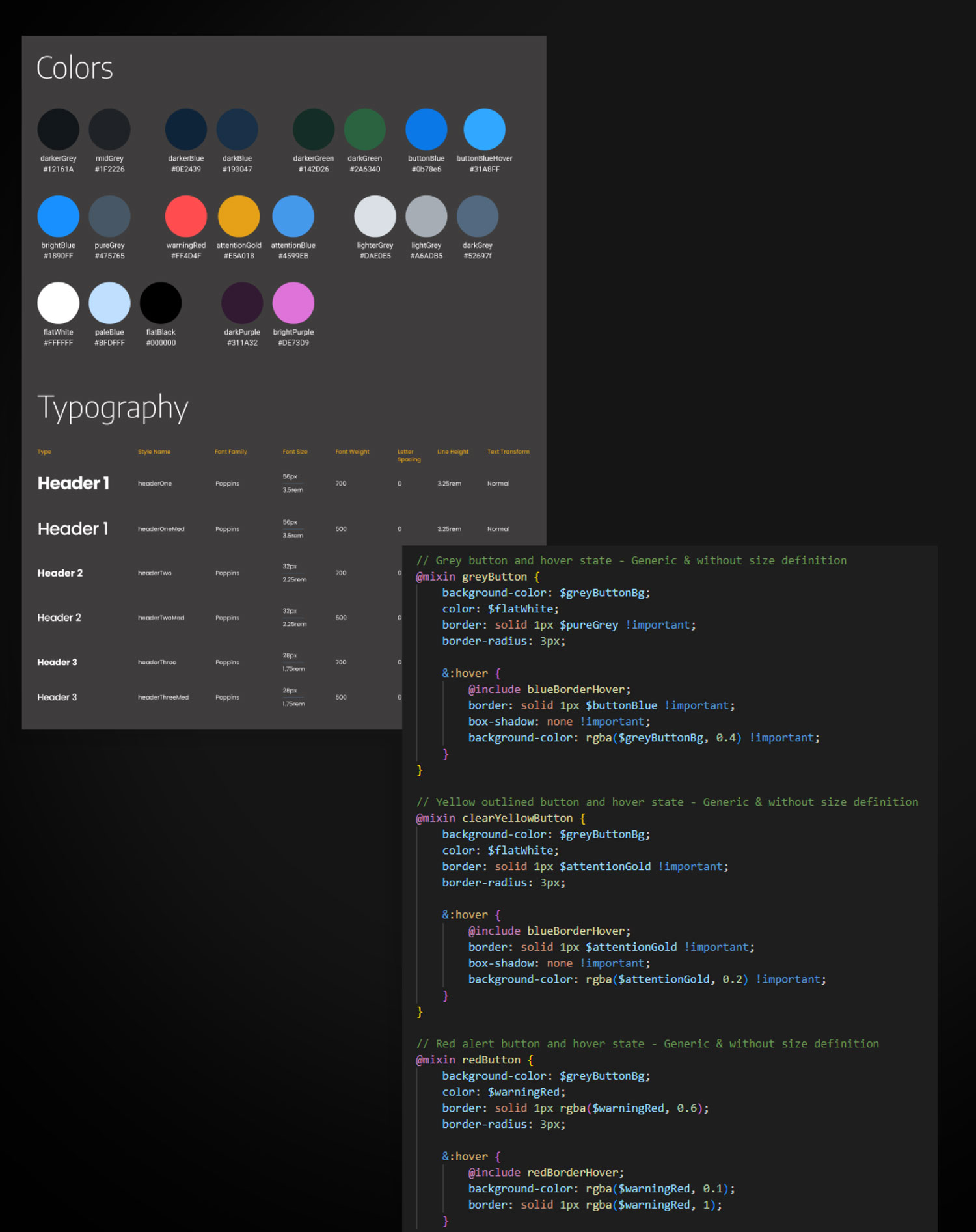
Coded Design System & Engineering Collaboration
To support Care1’s fast-moving roadmap and frequent releases, I implemented a coded design system that lived alongside the product codebase rather than as a static design artifact.
Instead of treating the design system as Figma-only documentation, I collaborated closely with engineering to ensure that core UI patterns were codified, reusable, and versioned through a shared SCSS mixin library.
What I Implemented:
- Centralized SCSS mixins for buttons, alerts, and interaction states
- Shared color and status semantics aligned with clinical meaning
- Reusable patterns without hard-coded sizing or layout assumptions
- These mixins acted as a single source of truth for UI behavior and styling.
Impact:
- Faster UI implementation and iteration
- Reduced design–engineering back-and-forth
- Fewer inconsistencies across data-dense screens
- Easier maintenance during CI/CD releases
This approach improved delivery speed while preserving UX quality and consistency.
Legacy System Migration (JavaScript → React)
I led the system-wide migration of Care1’s legacy JavaScript UI to a modern React + Ant Design architecture.
This was not a visual refresh. The migration required deep understanding of existing clinical workflows, data dependencies, and edge cases built up over years of real-world use. I worked closely with leadership and engineering to identify which behaviors were essential to preserve, which constraints could be removed, and where the foundation could be improved without disrupting clinical operations.
The migration enabled:
- A more scalable and maintainable front-end architecture
- Faster feature development and safer iteration
- Consistent, systemized UI patterns across the product
- Improved collaboration between design and engineering
Most importantly, it unlocked the ability to evolve the product thoughtfully, using a stable modern foundation rather than layering new features on top of technical debt.
Slide to see Before & After
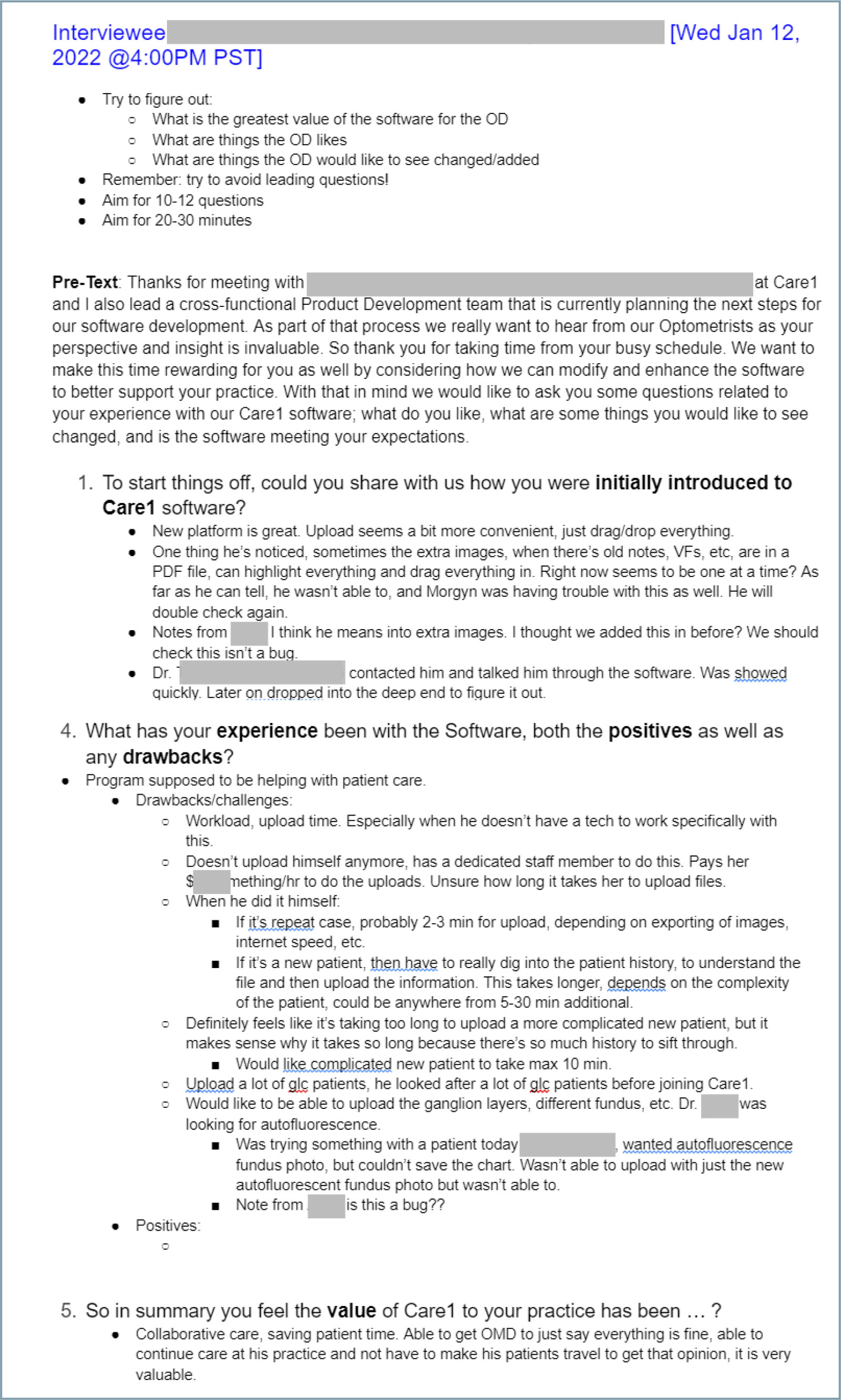
User Research and Feedback-Driven Iteration
I conducted regular UX interviews with clinicians and clinic staff to understand real-world workflows, pain points, and unmet needs. Sessions were structured, time-boxed, and designed to avoid leading questions, focusing instead on how the software was introduced, used, and experienced during patient care.
Insights from these interviews were systematically logged, synthesized, and translated into actionable backlog items. I partnered with product and engineering to prioritize this feedback using impact-based frameworks, ensuring the most critical usability and workflow issues informed sprint planning and roadmap decisions.
This continuous feedback loop allowed the product to evolve alongside clinical reality, resulting in faster workflows, clearer system behavior, and features that directly reflected how clinics operate day to day.
Reflection and Learnings
- In healthcare UX, clarity directly impacts patient outcomes
- AI must be designed with restraint, transparency, and feedback
- Workflow alignment matters more than visual novelty
- System thinking is essential for scaling complex SaaS products
- Strong UX leadership requires balancing usability, compliance, and delivery
Why This Project Matters
- Lead UX strategy in regulated, high-stakes environments
- Translate complex workflows into usable systems
- Partner deeply with engineering and data teams
- Design AI-assisted experiences responsibly
- Build scalable systems, not just screens